B2B Talent
Experienced Platform

B2B Talent
Experienced Platform

B2B Talent
Experienced Platform

Phenom

Overview

Overview

Phenom is a leading HR tech company offering SaaS-based talent experience solutions to enhance recruitment and attract top talent for B2B clients.

Phenom is a leading HR tech company offering SaaS-based talent experience solutions to enhance recruitment and attract top talent for B2B clients.

My contribution

Product strategy

User research

Product design

User testing

Continuous Improvement

The team

3 x product manager

3 x product designers

10 x engineers

3 x reseachers

Year

2021-2024

Helping a billion people
find the right job

Helping a billion people
find the right job

Helping a billion people
find the right job

Process

Process

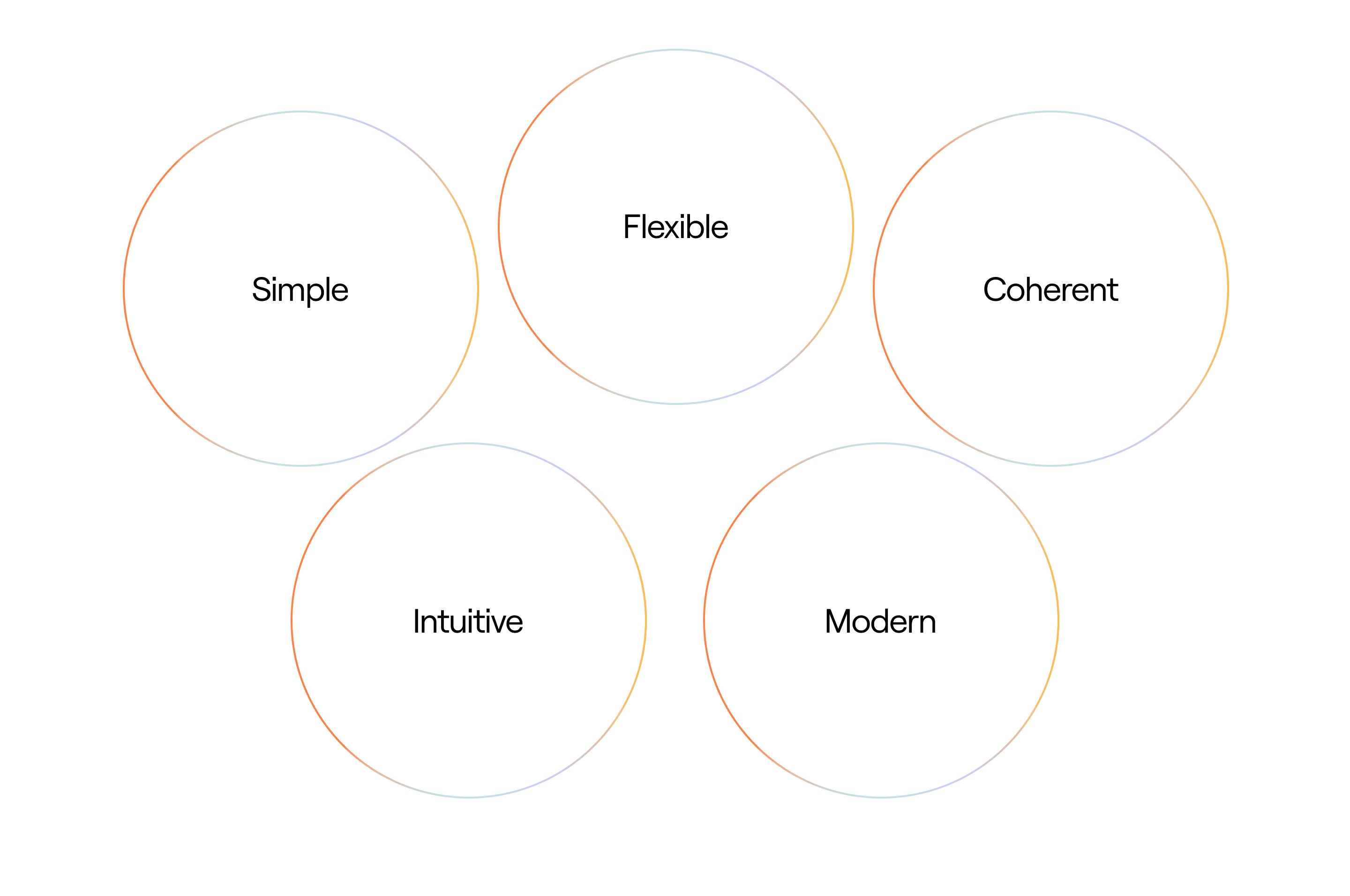
Setting the foundations

In October 2021, Phenom aimed to enhance their product by providing seamless onboarding for users. This initiative aimed to extend user adoption, assist users in saving time and resources, thus increasing revenue, and enhancing the product itself. Over 500 global brands rely on Phenom to hire and grow faster.

Top clients across industries use Phenom for talent hiring

Top clients across industries use Phenom
for talent hiring

Top clients across industries use Phenom for talent hiring

Core challenge

Core challenge

Through our interactions with users, I have identified a significant challenge: the absence of onboarding and tutorials but also of comprehensive analytics to monitor visits, conversions, and page engagement time. This feedback was repeated by 10+ interviewees.

Through our interactions with users,
I have identified a significant challenge: the absence of onboarding and tutorials but also of comprehensive analytics to monitor visits, conversions, and page engagement time. This feedback was repeated by 10+ interviewees.

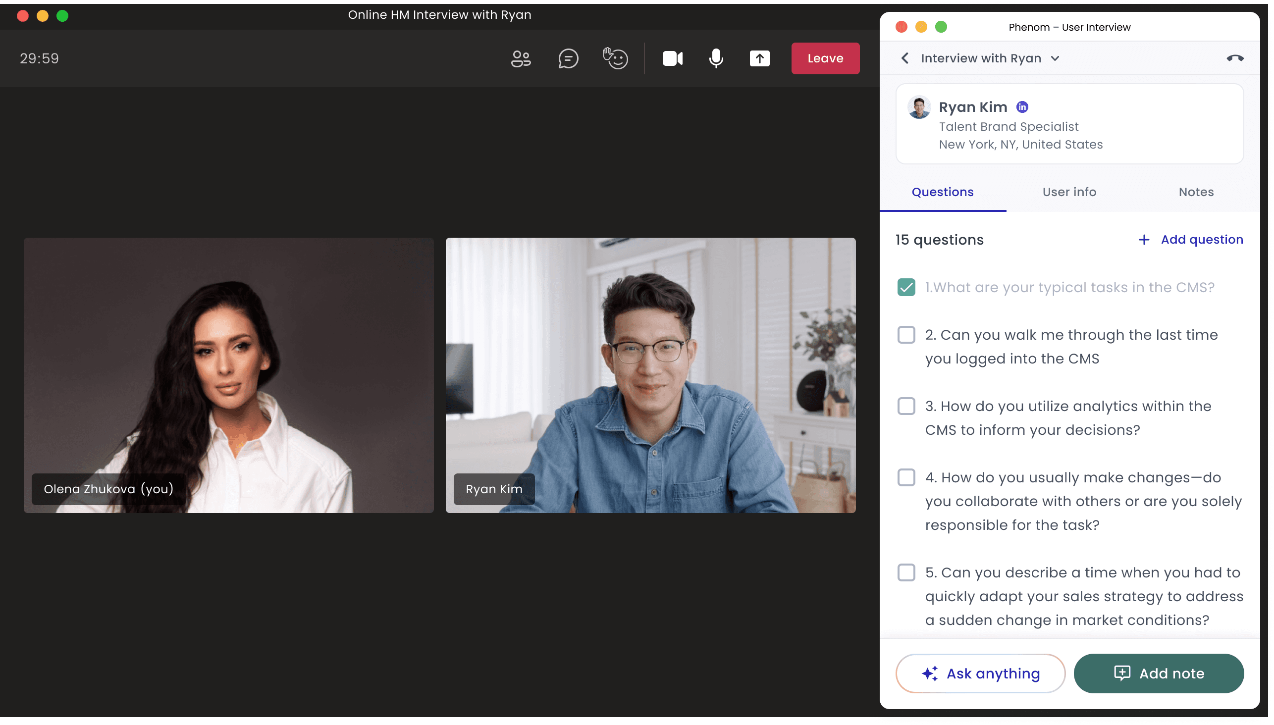
Interviews with Phenom CMS users

The Problem Statement

The Problem Statement

📚 Onboarding process

The absence of onboarding resulted in low satisfaction rates, as users struggled to navigate the interface and avoided using our product for hiring employees.
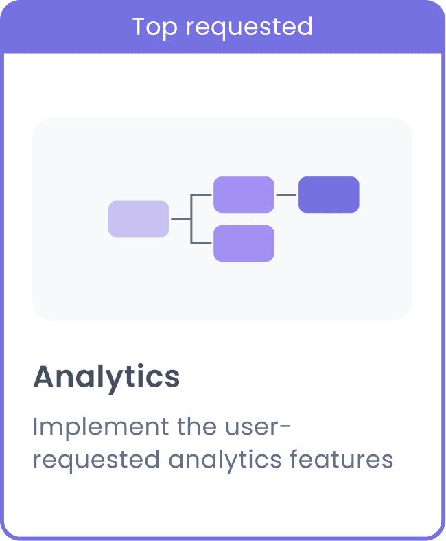
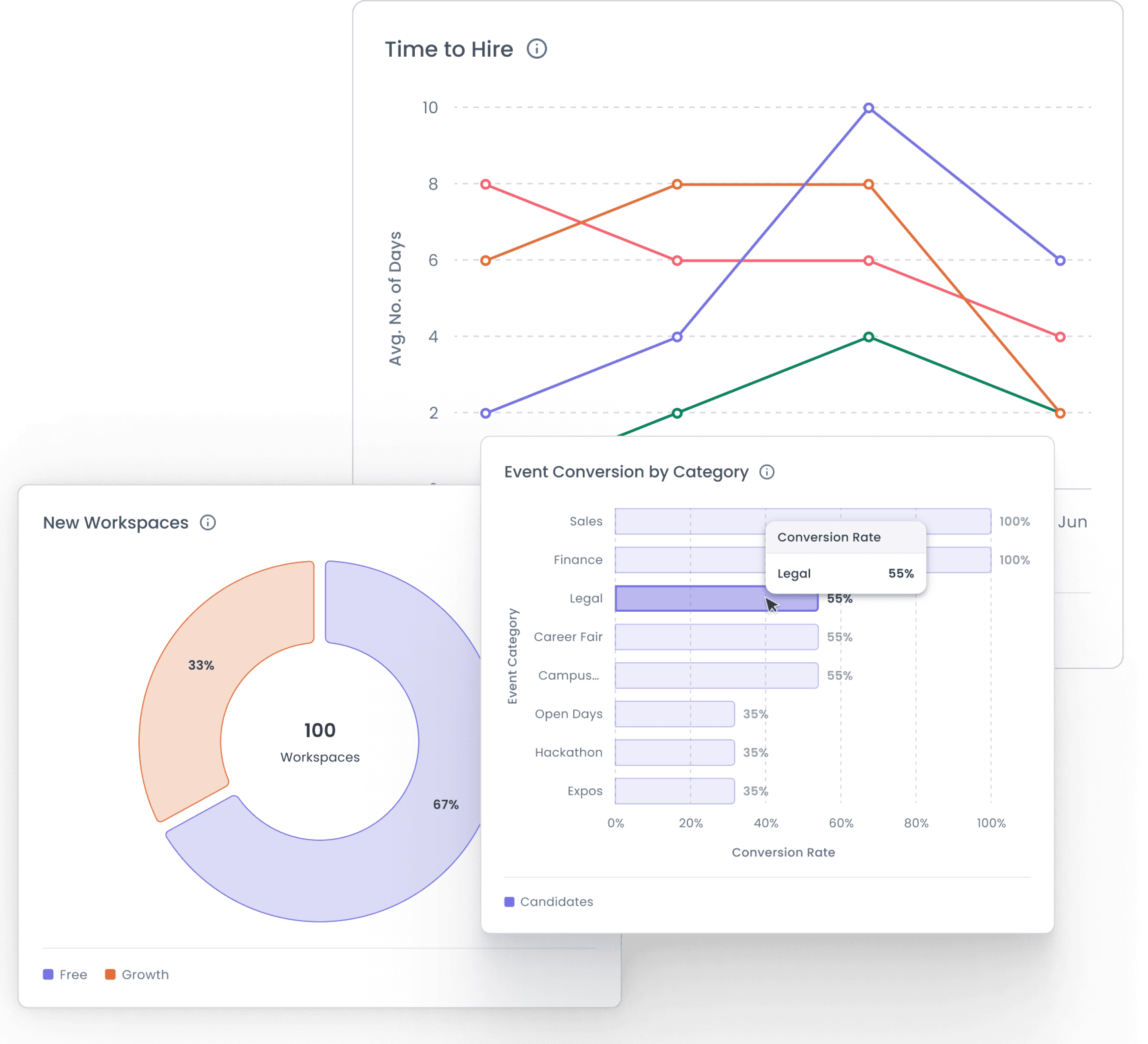
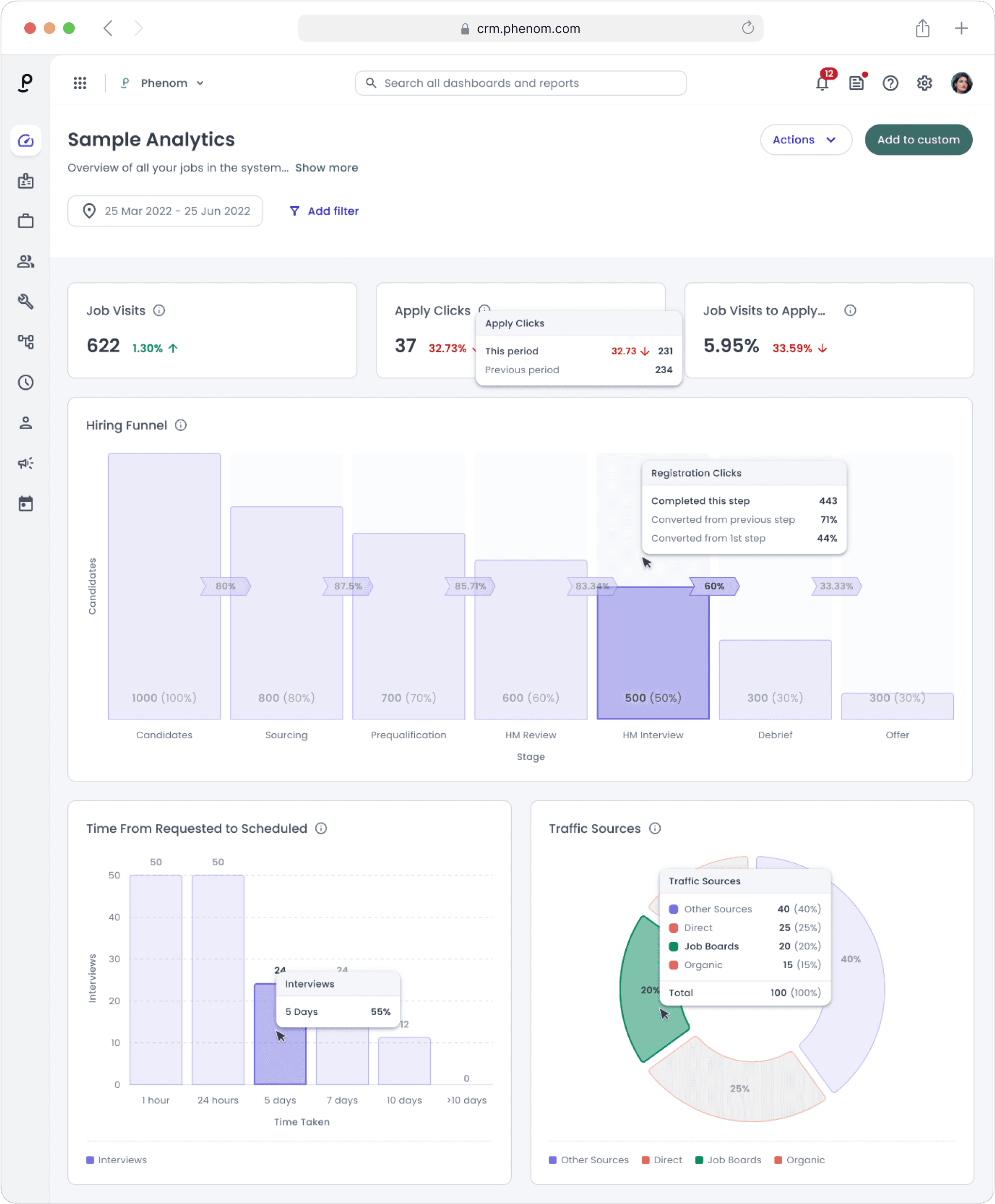
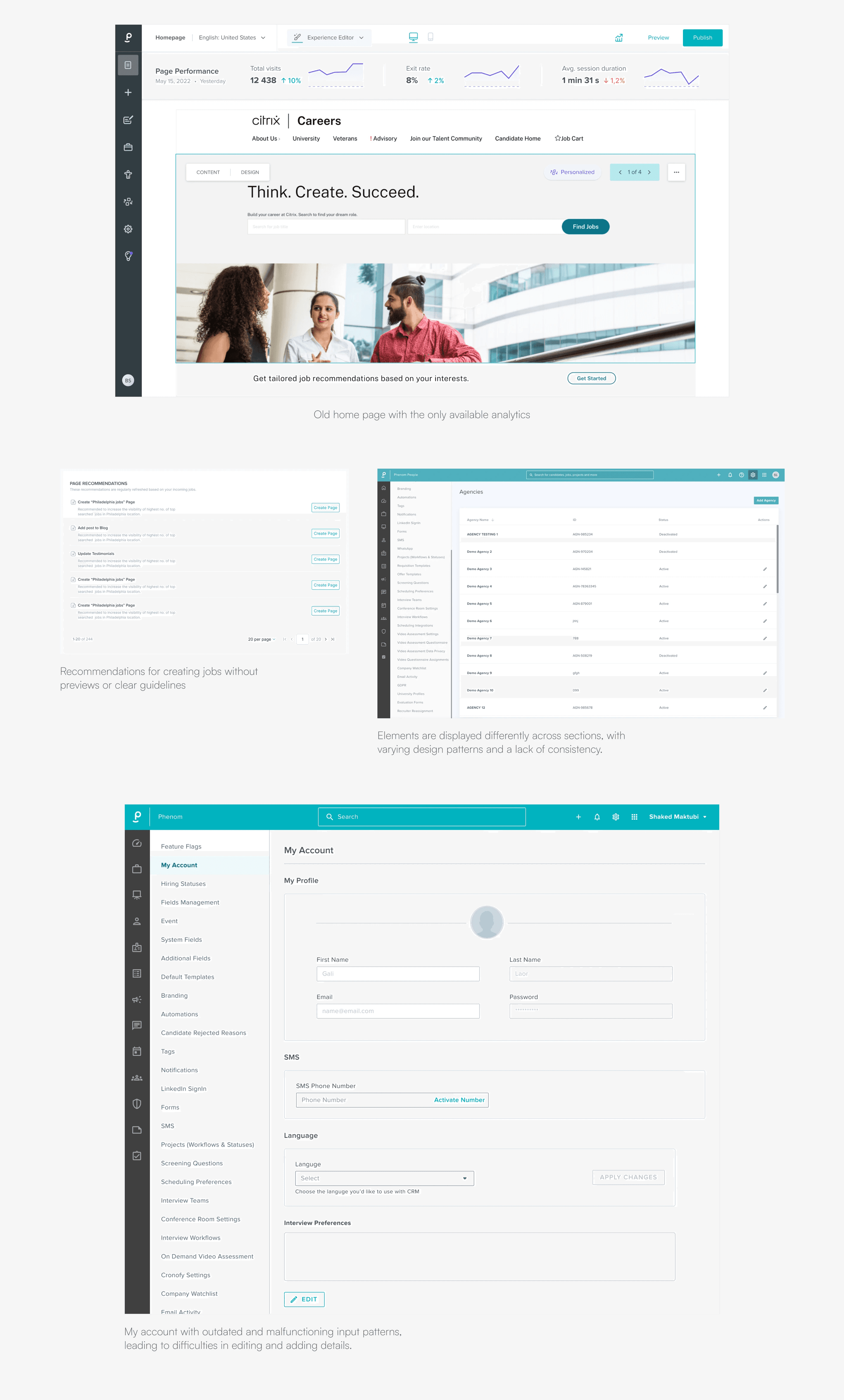
📊 No Analytics Date

The lack of analytics pushed users to rely on other services. This resulted in decreased user retention and engagement.

💻 Outdated User Interface

💻 Outdated User Interface

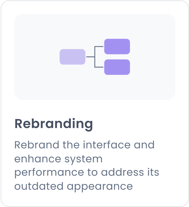
The CMS followed old UI paradigms from an outdated tech stack, leading to significant usability issues.

⚖️ Disjoined experience

Information and useful functions are scattered and isolated, limiting integration and meaningful insights.

Overview of the old experience

Overview of the old experience

Overview of the old experience

Empathise

Empathise

A two-week research phase was conducted to understand the key needs and write the problem statement. To achieve this, I used surveys, interviews, and competitor analysis.

A two-week research phase was conducted to understand the key needs and write the problem statement. To achieve this, I used surveys, interviews, and competitor analysis.

70+ users

70+ users

70+ users

Participaited in survey

11+ interviews

11+ interviews

11+ interviews

Conducted

Competitors

Competitors

Competitors

Mapped out a competitor

and SWOT analysis

Interview insights

Interview insights

🚀 Streamlined Onboarding = Satisfied Users

New users cannot complete the task because they need to create many tickets to communicate with a manager who explains how to set up the system.

🎯 Visual Analytics: A Clear Path to Insights

User interviews revealed that the lack of analytics pushed users to rely on other services. This led to too much effort and cost, creating a negative impression.

👩‍💻 High Cognitive Load

💻 Outdated User Interface

Users generally described their interaction experience with the system as complex and intricate, requiring a significant amount of mental effort to complete tasks.

🌠 Tracking and Transparency

Users have mentioned that their teams have various roles and they face issues when changes are made without others being aware of them.

Product strategy

Product strategy

The experience review identified key areas for improving the user experience. We have a plan to enhance the top-priority features.

Through our interactions with users,
I have identified a significant challenge: the absence of onboarding and tutorials but also of comprehensive analytics to monitor visits, conversions, and page engagement time. This feedback was repeated by 10+ interviewees.

PROCESS

We began with a comprehensive review of the current user experience.

We began with a comprehensive review of the current user experience.

KEY TAKEAWAYS

✍️

Several workflows and user experiences in the existing product scored very low in our benchmarking assessments.

🎯

High drop-off rates, particularly during widget editing, indicated overwhelming product complexity that needed to be addressed.

💡

We planned an end-to-end visual and usability refresh to modernize the CMS and make it more user-friendly and engaging.

Design Goals

Design Goals

The experience review helped us identify focus areas for the redesign.

The experience review helped us identify focus areas for the redesign.

SOLUTION

Final Outcome: Highlights

Final Outcome: Highlights

Each highlight showcases an aspect of the new CMS and CRM experience, specifying the design goal, the user scenario or problem its solving, and the solution provided.

Through our interactions with users,
I have identified a significant challenge: the absence of onboarding and tutorials but also of comprehensive analytics to monitor visits, conversions, and page engagement time. This feedback was repeated by 10+ interviewees.

The New Dashboard

DESIGN GOAL: FLEXIBLE

Role Switching

USER SCENARIO

With role-switching capability, users can have a personalized dashboard view. This feature allows different team members to focus on their specific tasks without overlapping duties, ensuring a smoother workflow and clearer accountability.

Through our interactions with users,
I have identified a significant challenge: the absence of onboarding and tutorials but also of comprehensive analytics to monitor visits, conversions, and page engagement time. This feedback was repeated by 10+ interviewees.

SOLUTION

A Talent Marketing Specialist responsible for editing content will not be able to publish content without the approval of the main manager. This prevents errors from both new and existing employees, ensuring that all content is reviewed and meets quality standards before going live. Additionally, this approval workflow fosters a collaborative environment.

Through our interactions with users,
I have identified a significant challenge: the absence of onboarding and tutorials but also of comprehensive analytics to monitor visits, conversions, and page engagement time. This feedback was repeated by 10+ interviewees.

DESIGN GOAL: COHERENT

In-depth analytics

USER SCENARIO

Talent Marketing Specialists and HR professionals often face challenges when they have to depend on multiple external analytics tools to compile comprehensive reports across various departments and regions.

SOLUTION

With integrated analytics, users can effortlessly monitor key metrics and generate detailed reports in one place. This streamlined approach not only saves time but also enhances data accuracy and accessibility, allowing for faster decision-making and a more efficient workflow.

Customizable analytics - Highlights personalization and flexibility, catering to individual user needs.

DESIGN GOAL: COHERENT

Design System for Consistent Branding

Design System for
Consistent Branding

USER SCENARIO

A large software company has multiple development teams working on different components of a single product. Each team uses its own design resources, leading to a fragmented user experience with inconsistent branding and design elements. This inconsistency confuses users and weakens the brand's identity.

Through our interactions with users,
I have identified a significant challenge: the absence of onboarding and tutorials but also of comprehensive analytics to monitor visits, conversions, and page engagement time. This feedback was repeated by 10+ interviewees.

SOLUTION

The introduction of a new design system offers a unified set of guidelines and assets that all teams can utilize. This system focuses on minimalistic design principles and a clean, white color scheme. By standardizing the design language, the system ensures that all components of the product look and feel cohesive, regardless of which team developed them.

Through our interactions with users,
I have identified a significant challenge: the absence of onboarding and tutorials but also of comprehensive analytics to monitor visits, conversions, and page engagement time. This feedback was repeated by 10+ interviewees.

Screenshots showcasing a few examples of our design system guidelines.

Screenshots showcasing a few examples of our design
system guidelines.

File structure

Screenshots showcasing a few examples of our design
system guidelines.

DESIGN GOAL: SIMPLE

Contextual primary
navigation options

PROBLEM

The old primary navigation in the CMS was cluttered with numerous pages and options, many of which were rarely used by users in their daily tasks. This created a high cognitive load and reduced the efficiency of users performing occasional edits.

Through our interactions with users,
I have identified a significant challenge: the absence of onboarding and tutorials but also of comprehensive analytics to monitor visits, conversions, and page engagement time. This feedback was repeated by 10+ interviewees.

SOLUTION

The redesigned primary navigation highlights the most frequently accessed sections, driven by real-time analytics and user session data. All configuration pages are consolidated under the 'More' menu, and an integrated search feature allows for quick discovery of specific controls.

Through our interactions with users,
I have identified a significant challenge: the absence of onboarding and tutorials but also of comprehensive analytics to monitor visits, conversions, and page engagement time. This feedback was repeated by 10+ interviewees.

DESIGN GOAL: SIMPLE

Simpler, clearer settings
across the app

PROBLEM

The CMS contains powerful controls for configuring the website and managing the recruitment process. However, the high number of controls, lack of organization, and unclear copy make it difficult for users to find what they need.

Through our interactions with users,
I have identified a significant challenge: the absence of onboarding and tutorials but also of comprehensive analytics to monitor visits, conversions, and page engagement time. This feedback was repeated by 10+ interviewees.

SOLUTION

We implemented improved information architecture, logical grouping of similar and dependent controls, clearer copy, and simplified configuration methods throughout the app to enhance user experience.

Through our interactions with users,
I have identified a significant challenge: the absence of onboarding and tutorials but also of comprehensive analytics to monitor visits, conversions, and page engagement time. This feedback was repeated by 10+ interviewees.

DESIGN GOAL: COHERENT

A consistent view candidates profiles

PROBLEM

The candidate information was spread across different pages, making it difficult to find everything needed for interviews quickly. Users spent a lot of time searching and often resorted to making notes outside the system, which led to the loss of important details.

SOLUTION

All candidate information is consolidated in one place, eliminating the need to search across multiple pages and reducing the time spent gathering information. This approach improves UX by providing quick and easy access to comprehensive candidate data.

Ket Outcomes

Ket Outcomes

⚡️Rebranding

Updated the user interface to align with Phenom’s new brand identity, resulting in a 25% increase in brand recognition and customer satisfaction.

📊 Analytics Integration

Implemented robust analytics tools, boosting data-driven decision-making by 40% and enhancing strategic planning capabilities.

🪜System Performance

💻 Outdated User Interface

Improved system architecture, reducing load times by 50% and increasing operational efficiency by 30%.

👩‍💻User Experience

Enhanced navigation and usability, leading to a 45% rise in user satisfaction and a 20% increase in client retention.

Next Project

Next Project

Finance app

Finance app

{05} — Let’s Connect

Amazing things can begin with just a simple "hello"

Amazing things can begin with just a simple "hello"

Contact me

👩🏻‍💻

Olena.

Made with love by Olena Zhukova

👩🏻‍💻

Olena.

Made with love by Olena Zhukova

👩🏻‍💻

Olena.

Made with love by Olena Zhukova